The care compliance dashboard was supposed to make your life easier. Instead, it sits in a browser tab nobody visits, showing a percentage that never moves and a colour that never changes. You bought it because you wanted oversight. What you got was another screen to ignore.
The problem is not the software. The problem is that most compliance reporting in care homes is built for the inspection, not for the decision. It answers a vague question, "how are we doing?", with a number that looks fine on the surface and tells you nothing about what to do next. Your seniors open it once, see green, and close it. Then they go back to running the service with the same mental checklist they have always used.
This article is about building a view they will actually check. Not a prettier dashboard. A view that answers one question in thirty seconds and tells someone whose name is on the problem.
Why Your Compliance Dashboard Is Gathering Dust
The uncomfortable truth is that most compliance reporting in care homes is designed backwards. It starts with the data you think you should track, then arranges it into charts and percentages. The result is a screen that looks impressive in a board pack and useless on a Tuesday morning.
A dashboard that shows 94% training compliance is technically accurate. It is also completely unhelpful. Which six staff members are holding that number down? Which modules are overdue? Which shifts are affected? Without those answers, the percentage is decoration. Your seniors cannot act on a percentage. They can act on a name and a date.
There is a gap between what owners want to see and what seniors need to act on. The owner wants trends across sites, benchmarking, a sense that the group is moving in the right direction. The shift lead wants to know that two carers have moving and handling training overdue by more than a fortnight and one DBS check expires next week. Both views matter. They are not the same view.
The cost of a view nobody checks is not abstract. Missed renewals surface during inspections. Expired DBS checks become urgent on a Friday afternoon. Training gaps get discovered when a staff member is already in front of a resident, not when there is time to fix them. And the quiet risk underneath it all is that staff make decisions without current policy access because nobody noticed the policy update was never acknowledged.
Start With the Decision, Not the Data
Every element on a compliance view must support a decision someone will actually make this week. If it does not, it does not belong there. That is the whole discipline. It sounds simple. It is rarely applied.
A care compliance dashboard should support three decisions. Who needs training now. Whose renewal is due. Which location is falling behind. Everything else is secondary, and most of it can live one click deeper.
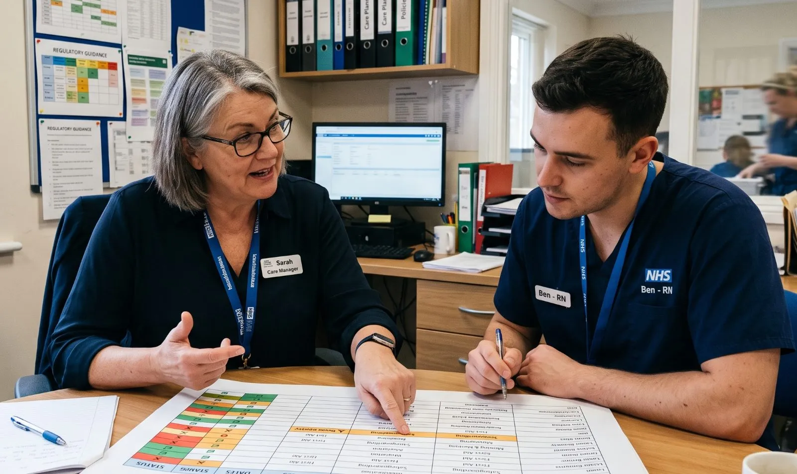
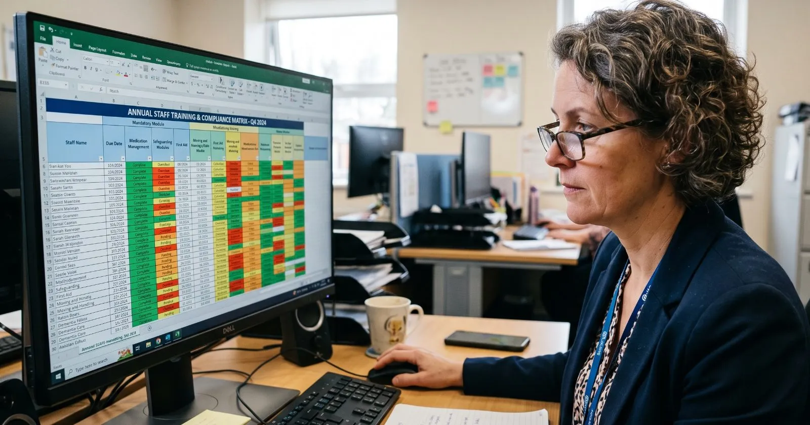
Take a training compliance overview as an example. A single green percentage tells you nothing actionable. A list of overdue modules by staff member, with days overdue and shift pattern, tells you exactly what to do. You can see that a night shift carer has missed two modules and is working this weekend. You can assign cover, arrange the training, and close the gap before it becomes a supervision issue.
Ask yourself a blunt question before adding anything to the view: "What will my senior carer do differently after looking at this screen for thirty seconds?" If the answer is nothing, the screen is decoration. Delete it.
There is also the trap of the always green dashboard. When everything looks fine, nobody looks. A compliance reporting approach that flags exceptions, not averages, gets opened. People check the view because it occasionally shows them something that needs attention. That is not a failure of the system. That is the system working.
What to Leave Off the View
Most compliance dashboards fail because they try to show everything. The discipline of subtraction is harder than the discipline of addition, and it matters more.
Leave off historical trends nobody acts on. A twelve-month graph of training completion is interesting to an analyst. It does not help a registered manager decide what to do this afternoon. Leave off location-wide averages. They hide the specific problems you need to see. Leave off any metric that does not map to a specific regulatory requirement or operational risk.
Book a short demo and see how CareStream keeps your policies, training and CQC evidence in one place.
Book a demoLeave off data that belongs to another role. The registered manager's view is not the owner's view. The owner wants benchmarking across sites and cost certainty. The manager wants this week's overdue list. When you try to serve both audiences on one screen, you serve neither.
Leave off anything that requires interpretation. If a senior cannot look at the screen and know exactly what to do next, the view is still a report, not a tool. A report explains. A tool directs.
The exception rule is the simplest way to apply all of this. If it is not overdue, not expiring, or not failing, it does not need to be on the first screen. Drill-down can hold the rest. Your staff compliance tracker should show exceptions, not the whole picture.
Who Owns the View?
The missing piece in most compliance reporting setups is ownership. A dashboard with no named owner is a dashboard nobody updates, and nobody trusts. It becomes a shared responsibility, which means it becomes nobody's responsibility.
The registered manager should own the compliance view for their site. They carry the regulatory accountability, so they should carry the reporting habit. That does not mean they do all the data entry. It means they are the person who looks at the view every week, asks the awkward questions, and makes sure the follow-up happens.
For groups, the structure is slightly different. A compliance lead or quality manager owns the multi-site view, but each site's registered manager owns their local numbers. The group view rolls up from site-level truth, not the other way round. When the group view is built from real site data, it is trustworthy. When it is built from spreadsheets that managers fill in to keep head office quiet, it is fiction.
Ownership means a weekly habit, not a quarterly panic. Ten minutes on a Monday morning to review what is overdue and assign the follow-up. That is the whole ritual. It is small enough to survive a busy week and regular enough to catch problems before they compound.
The handoff problem is real. When a manager leaves, the compliance view often dies with them. The new manager inherits a spreadsheet they do not understand and a reporting rhythm nobody explained. The view should be simple enough that a new manager can pick it up in a day. If it takes a week to learn, it is too complicated.
What a Useful Compliance View Looks Like in Practice
A view that gets used has a clear anatomy. Overdue items at the top, sorted by days overdue, with a named owner and a clear next action. That is the whole first screen. Everything else is secondary.
A training compliance overview done properly reads like this: three staff members have mandatory training overdue, two by more than fourteen days; here are their names and shifts. That is a sentence a manager can act on. It is not a percentage. It is a to do list with names on it.
Renewals and vetting follow the same pattern. DBS checks, right to work, professional registration. A staff compliance tracker that flags these by date, not by audit season, means you see the expiry coming weeks before it happens. You do not discover it during an inspection or, worse, after a shift has already been worked.
Policy access is a compliance signal most dashboards ignore. Unanswered staff questions and unacknowledged policy updates are early warning signs. If staff cannot access policies, they cannot follow them. If they are not asking questions, they are either not engaging or they are guessing. Both are risks worth seeing.
The evidence angle matters too. Every view should generate a record. When the inspector asks how you track compliance, the answer is a live report, not a spreadsheet you built last week. The view is not just for you. It is the proof that you knew, that you acted, and that you followed up.
How CareStream Builds the View for You
CareStream's compliance and training views are built around what is overdue and who it belongs to, not a percentage that is always green. That is the design principle from the first section, applied to the product.
The staff hub feeds the view automatically. Every question a staff member asks, in any of 60+ languages, is logged. Every training module completed is recorded. The evidence builds itself without anyone filling in a spreadsheet. That is the difference between a compliance view you maintain and one that maintains itself.
The CQC Readiness Report and policy gap detection turn the view into action. Unanswered questions flag where policies are not landing with staff. Legal change tracking keeps the view current without you having to monitor every update yourself. The view tells you what needs attention, not just what has already gone wrong.
A quick demo shows exactly how CareStream would work for your service. Book a time that suits you.
Book a demoFor groups, the multi-site console benchmarks across locations, so the owner sees which site is falling behind without waiting for a monthly report. The registered manager still owns their local numbers. The group view rolls up from site-level truth.
Set up takes under an hour. No app download for staff, no password friction. The view is populated from day one because staff actually use the hub. A compliance view fed by real usage is worth more than a dashboard fed by manual entry.
The Habit That Makes It Work
The view is only as good as the weekly rhythm around it. A fifteen-minute Monday review of overdue items, with actions assigned, beats a full-day quarterly audit every time. The audit finds problems after they have happened. The weekly review prevents them.
Make the review a supervision moment. Go through the training compliance overview with each senior, so they own their team's numbers. When a senior carer sees the same list you see, the follow-up happens faster. It is no longer your problem alone.
Use the view in team meetings. Show staff what is overdue and what is coming up. Transparency beats surprise reminders. When staff understand why training matters and when it is due, they are more likely to complete it without being chased.
When something is overdue, the question is "what is the barrier?" not "who is to blame?" The view tells you what. The conversation tells you why. Maybe the staff member could not get shift cover. Maybe the module would not load on their phone. Maybe they did not know it was due. The fix is different in each case.
The goal is a view that survives inspection season because it is part of how you run the service, not something you dust off when CQC calls. That is the difference between compliance theatre and compliance practice.
Start With One Question
The test for any compliance reporting tool is simple: will my seniors open this on a Tuesday morning? If the answer is no, the tool is a filing cabinet, not a compliance system. It does not matter how many features it has or how impressive the charts look.
Start with the decision you need to make this week, not the data you think you should track. Build the view around that decision. Strip everything else away. Add things back only when they support a decision someone will actually make.
The quiet win is that when staff see the compliance view leads to action, they start using it. Adoption follows usefulness, not the other way round. Staff do not use tools because they are told to. They use tools because the tools make their work easier and safer.
CareStream's 14-day free trial is the practical next step. No charge until day 14, cancel anytime, simple pricing with no surprises. You can see whether the view works for your service before you commit to anything.
The promise is not a better dashboard. The promise is a view your seniors actually check, evidence that builds itself, and a team that uses it. That is the view worth building.
Conclusion: A View Your Seniors Actually Open
The discipline in this article is subtraction, and the reason most dashboards fail is that they are fed by hand. A view maintained through manual entry drifts toward completeness, because whoever is filling it in has no way of knowing which fields matter, so they fill in all of them.
CareStream inverts that. The staff hub feeds the view as a byproduct of people doing their jobs: every question asked, in any of sixty-plus languages, every module completed, every policy acknowledged. Nobody types it in, which means the view can afford to show only what is overdue and who owns it, because the rest is already captured underneath and one click away. Policy access becomes a visible signal rather than an invisible one, so unanswered questions and unacknowledged updates surface as early warnings rather than as inspection findings.
For groups, the multi-site console rolls up from site-level truth rather than from spreadsheets managers complete to keep head office quiet, which is the difference between a group view that is trustworthy and one that is fiction. None of this creates the weekly habit. Ten minutes on a Monday is a management decision, not a software feature. What it does is make sure that when someone opens the view, what they see is a list with names and dates on it, and that opening it was worth the ten minutes.
Sources
- GOV.UK: DBS check: what employers need to know · gov.uk
- CQC: Regulation 19: Fit and proper persons employed · cqc.org.uk
- CQC: DBS checks for CQC registration · cqc.org.uk
- CQC: Regulation 18: Staffing · cqc.org.uk
- CQC: Regulation 17: Good governance · cqc.org.uk
- NMC: Revalidation · nmc.org.uk
Frequently asked
Why does a green percentage fail as a compliance metric?
Because nobody can act on it. Ninety four percent training compliance is accurate and useless: it does not name the six people holding the number down, the modules they are missing, or the shifts affected. A senior can act on a name and a date. They cannot act on an average. There is also a behavioural problem, which is that a view showing green every week trains people to stop opening it.
What should actually be on the first screen?
Overdue items, sorted by days overdue, with a named owner and a next action. That is close to the whole of it. Anything not overdue, not expiring and not failing belongs one click deeper. The test for adding anything is blunt: what would a senior do differently after thirty seconds on this screen? If the answer is nothing, it is decoration.
Should the owner and the registered manager share a view?
No. The owner wants trends across sites, benchmarking and cost certainty. The registered manager wants this week's overdue list with names on it. Both are legitimate and they are different products. A screen built to serve both usually serves neither, and the compromise version is the one that ends up in a browser tab nobody visits.
Who should own the compliance view?
The registered manager for each site, because they carry the regulatory accountability. For groups, a compliance or quality lead owns the multi-site roll-up, while each manager owns their local numbers. The direction matters: the group view should be built from site-level data rather than from returns managers' complete to satisfy head office, or it becomes a description of reporting rather than of the service.
How often should the view be reviewed?
Weekly, in about ten to fifteen minutes. A Monday review that assigns follow up catches problems before they compound. A quarterly audit finds them after they have happened. Keeping the ritual small is the point, because a habit that takes an hour will be the first thing dropped in a difficult week.
Written by
 Len BurgessSenior Care Advisor
Len Burgess has worked in the care sector for over 8 years, with hands-on experience across residential, nursing and community settings. Having supported teams through CQC inspections and the day-to-day reality of keeping a service compliant, he writes about regulation, quality and best practice in a way that's grounded in what actually happens on the floor, not just what the guidance says.